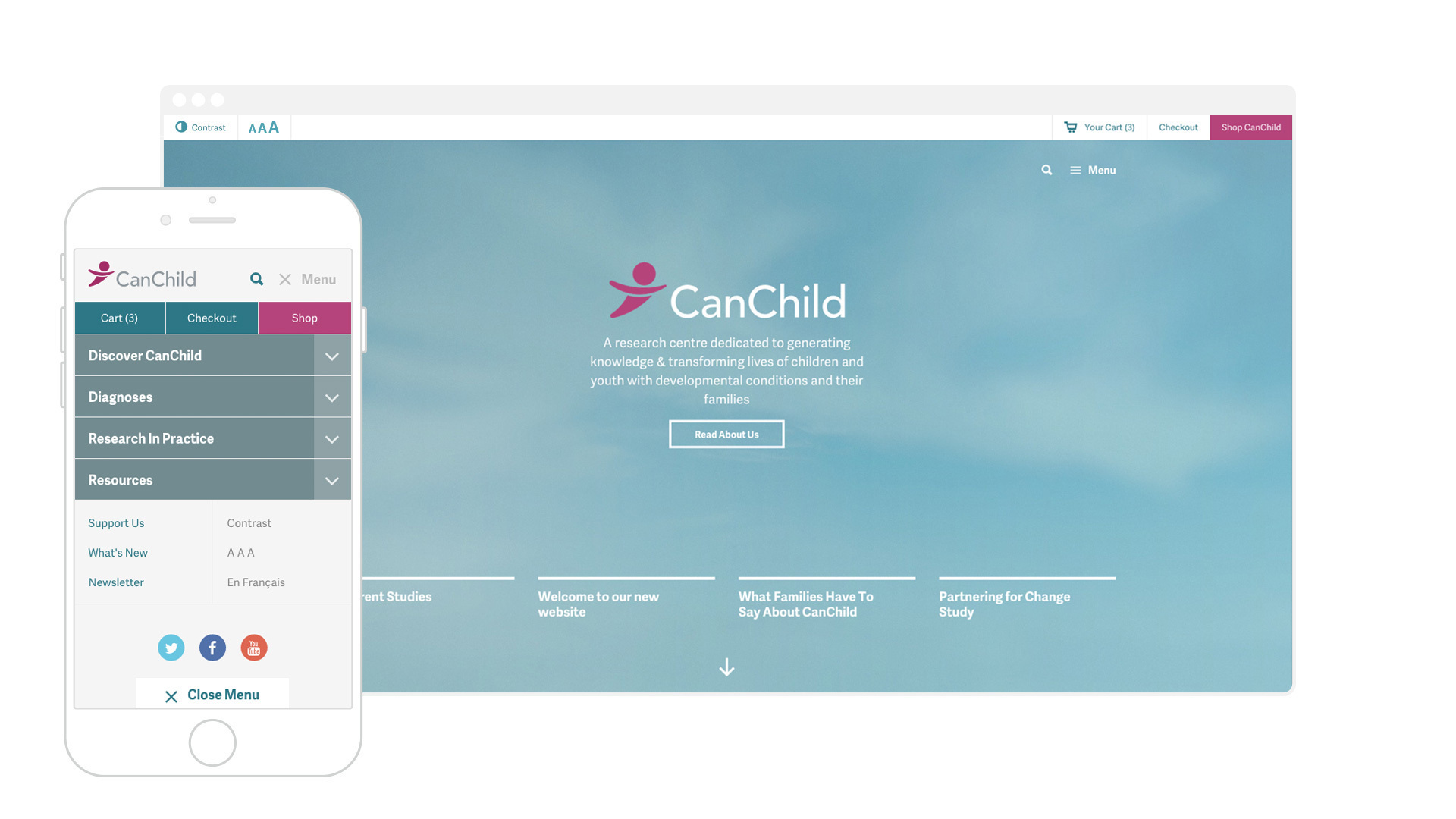
Welcome to our new website!
Responsive, Fast, Intuitive
While redesigning our site, we wanted to make our content easily accessible the moment you want it, wherever you are. Our new site is now fully responsive to any screen size – desktop, mobile or tablet!
Not only is it important that you are able to access our content from any device but we also designed a site that allows you to easily find what you are looking for.
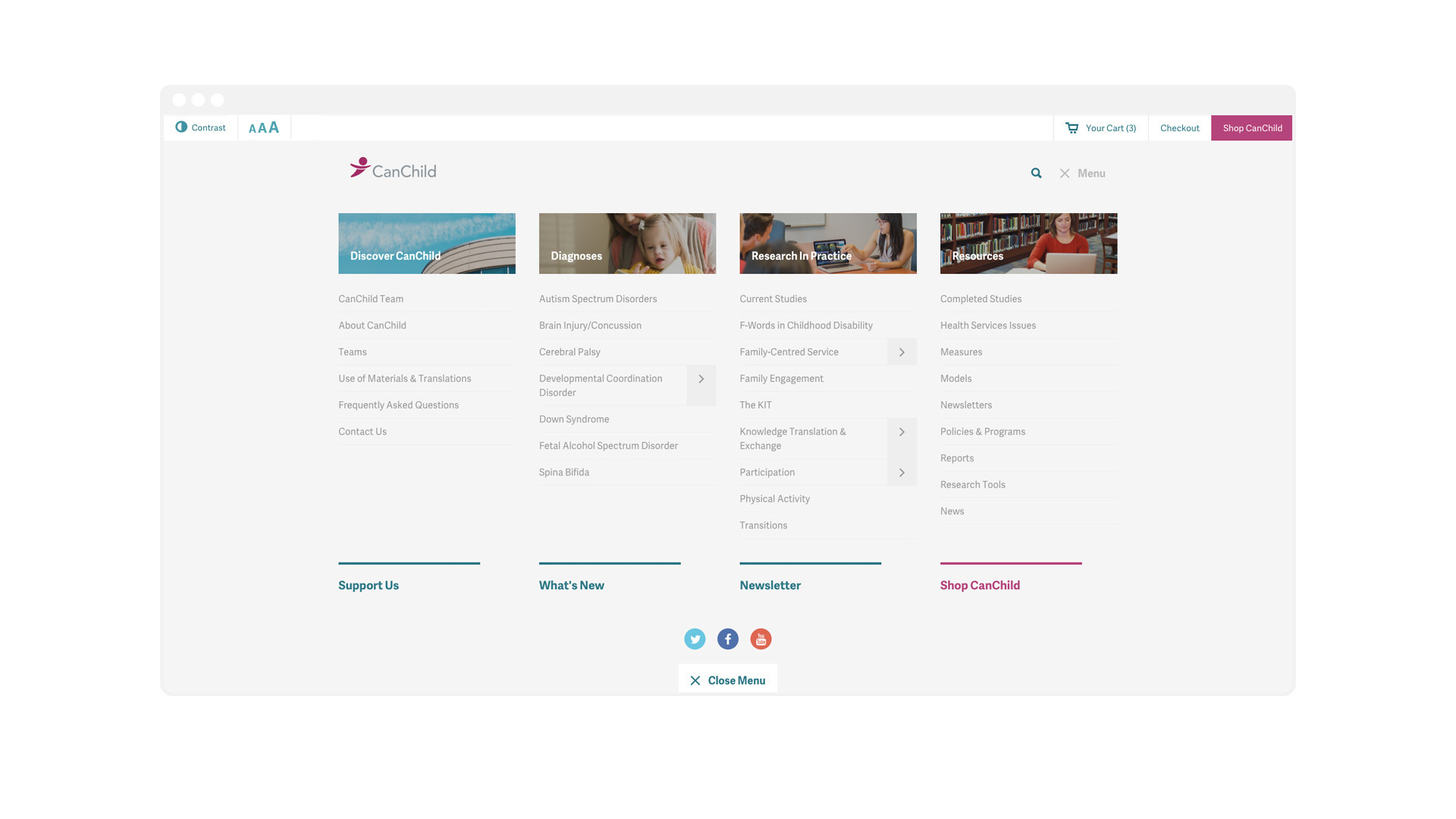
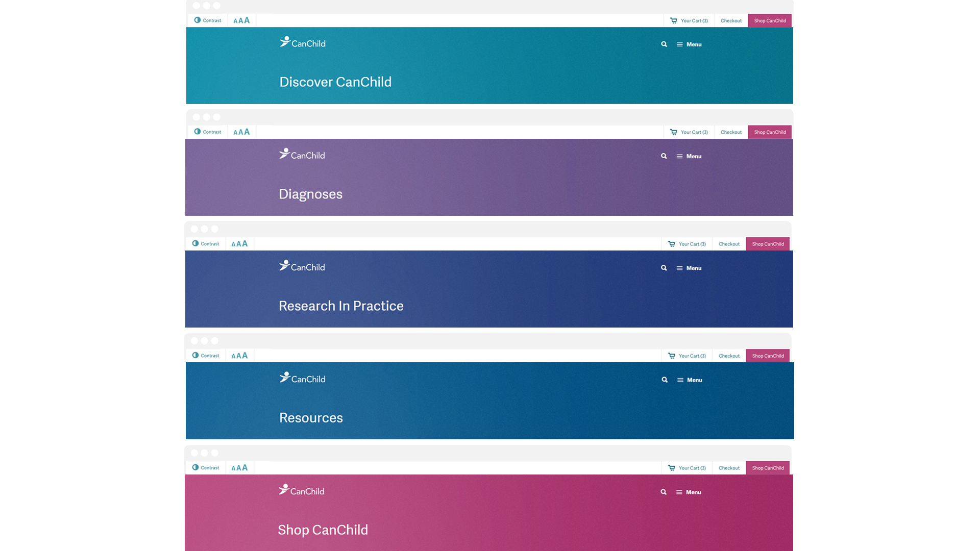
Simple Navigation, Integrated Content, & Improved Shop
Our new site redesign features a new navigation and architecture, making it easier to find exactly what you are looking for. Our entire site is now broken into four main sections: Discover CanChild - where you can learn more information about us and our team, Diagnoses - a hub to find out information on specific types of conditions, Research In Practice - a place to explore themes and topic areas that the CanChild team are experts in, and finally Resources - a library of all our materials generated by our research studies. We've made huge improvements on the integration of content and related materials within each page, allowing you to easily flow between content and never getting lost. In addition, the CanChild Shop has seen incredible improvements to the look and the customer experience.
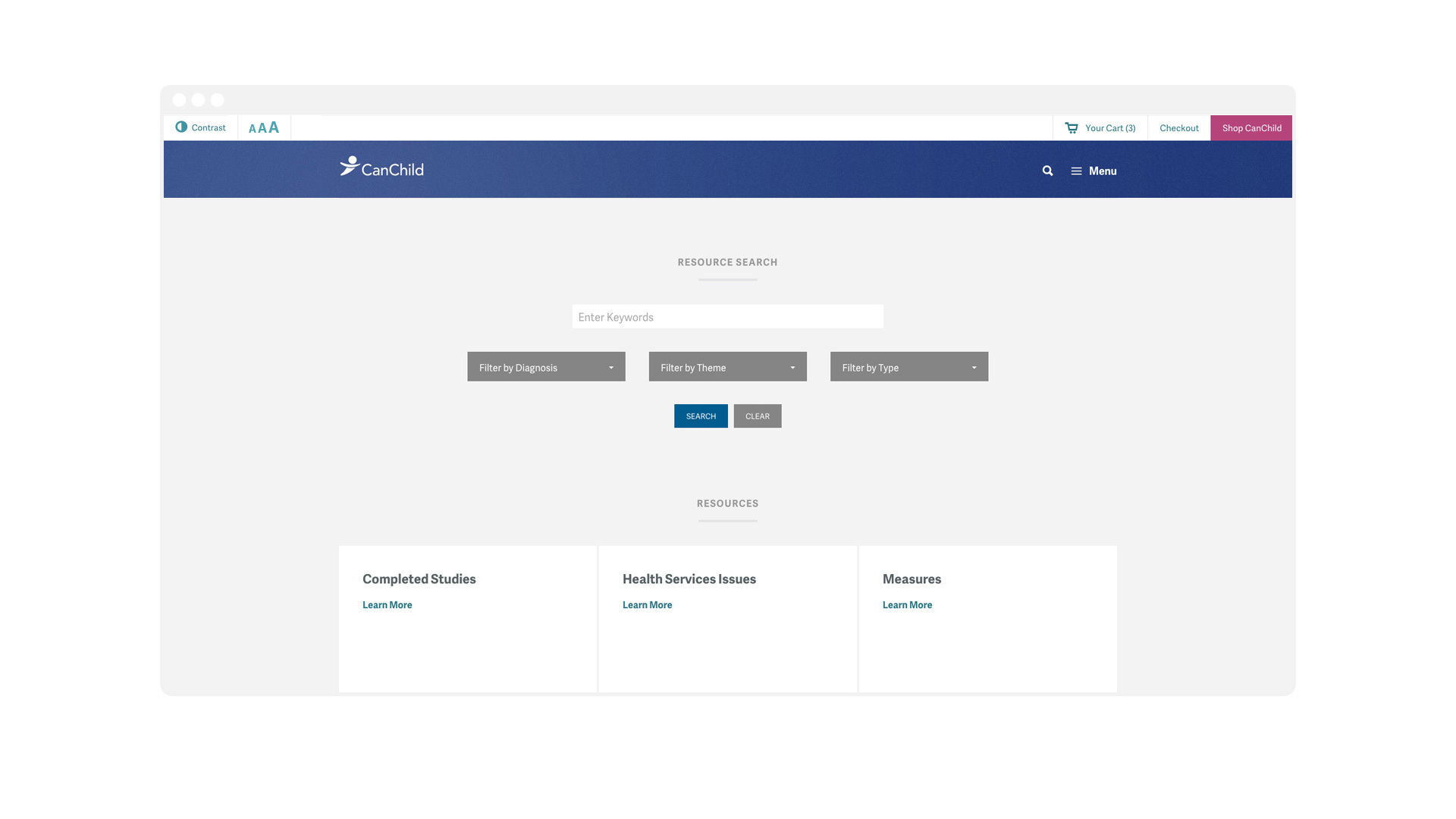
Advanced Search
Our site now features an advanced search bar that allows you to filter items by Diagnosis, Themes and/or Research Type – making it easier than ever before to find exactly what you are looking for! The best part? our entire site is now searchable no matter what page you're on, no more issues of being constrained to certain sub-sites or areas.
Colour Coded pages
You talked and we listened: to greatly improve the user experience, we've colour coded the main sections of our site, making it easy for you to know exactly which area you are in, helping you navigate through the volume of content and find the information you're looking for!
See how we’ve changed through the years...
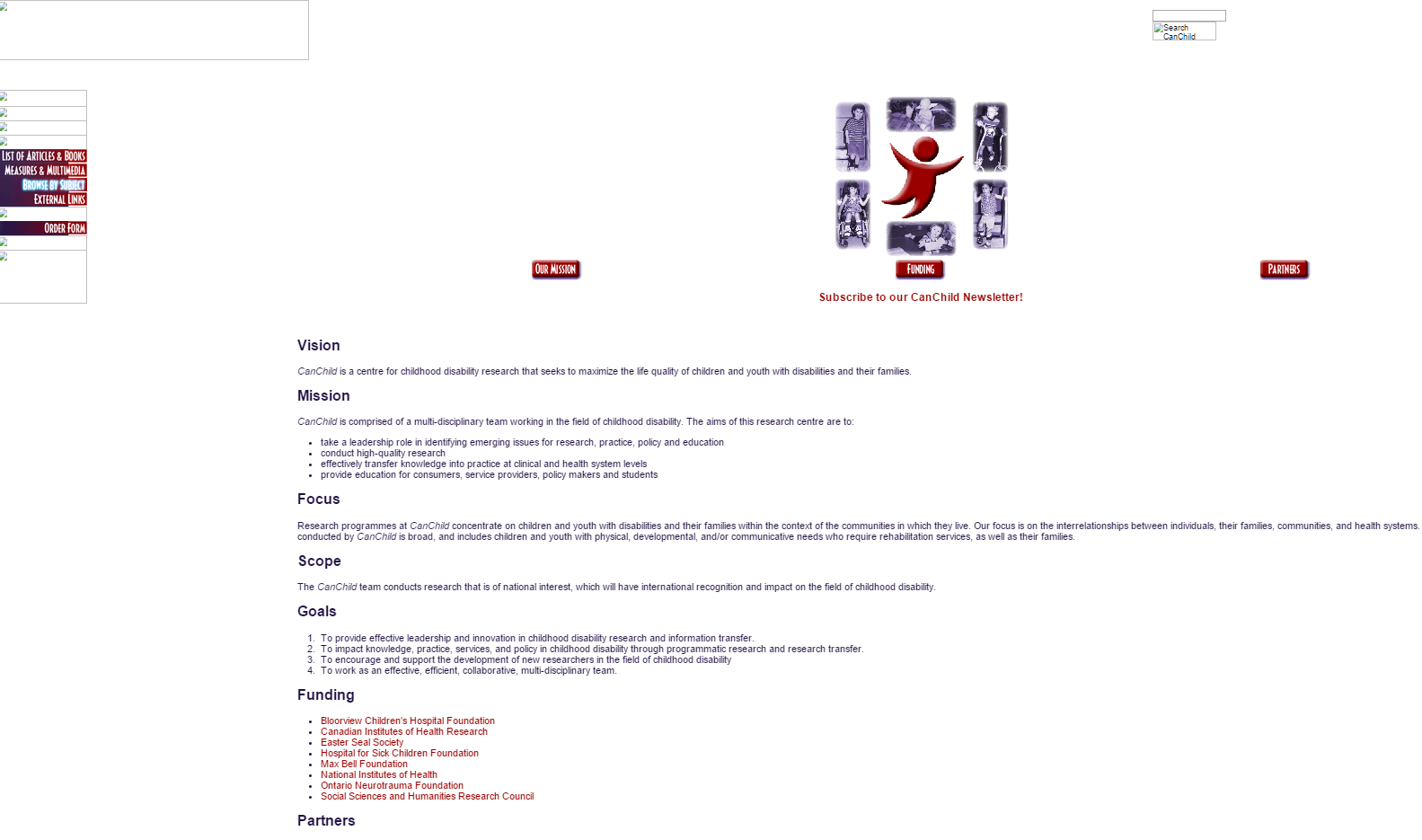
2002
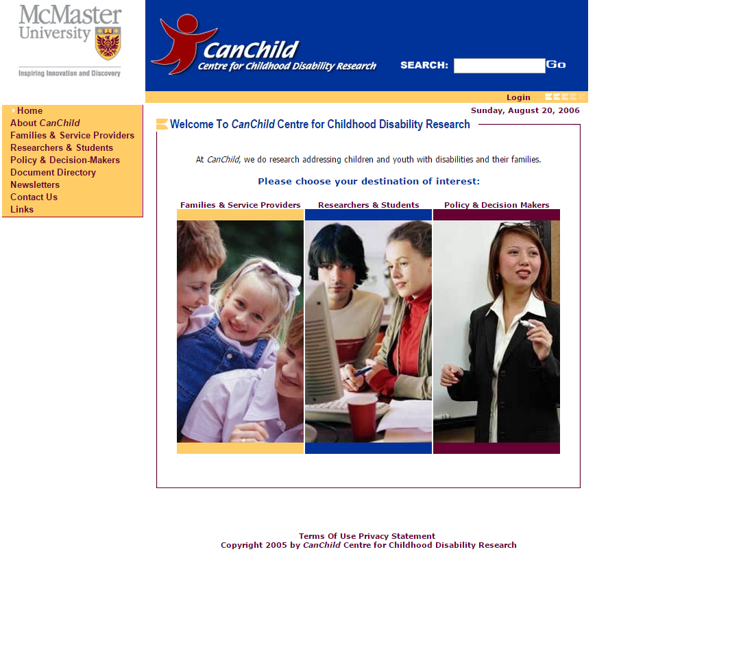
2006
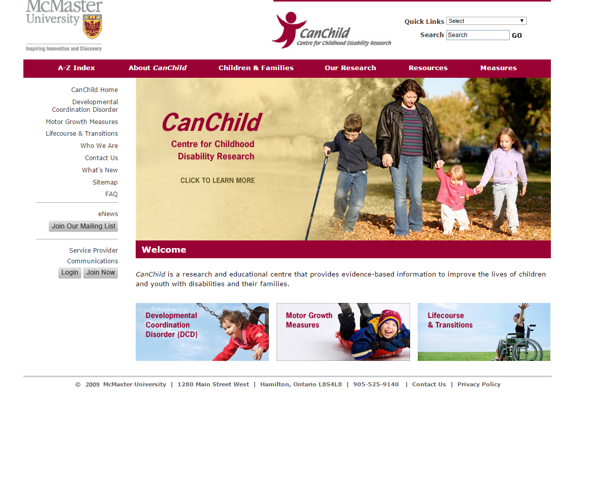
2009
2014